What a footprint chart shows
Big green candle, straight through resistance. You bought the close. It was the last candle up — because inside it, the buyers weren't starting. They were finishing.
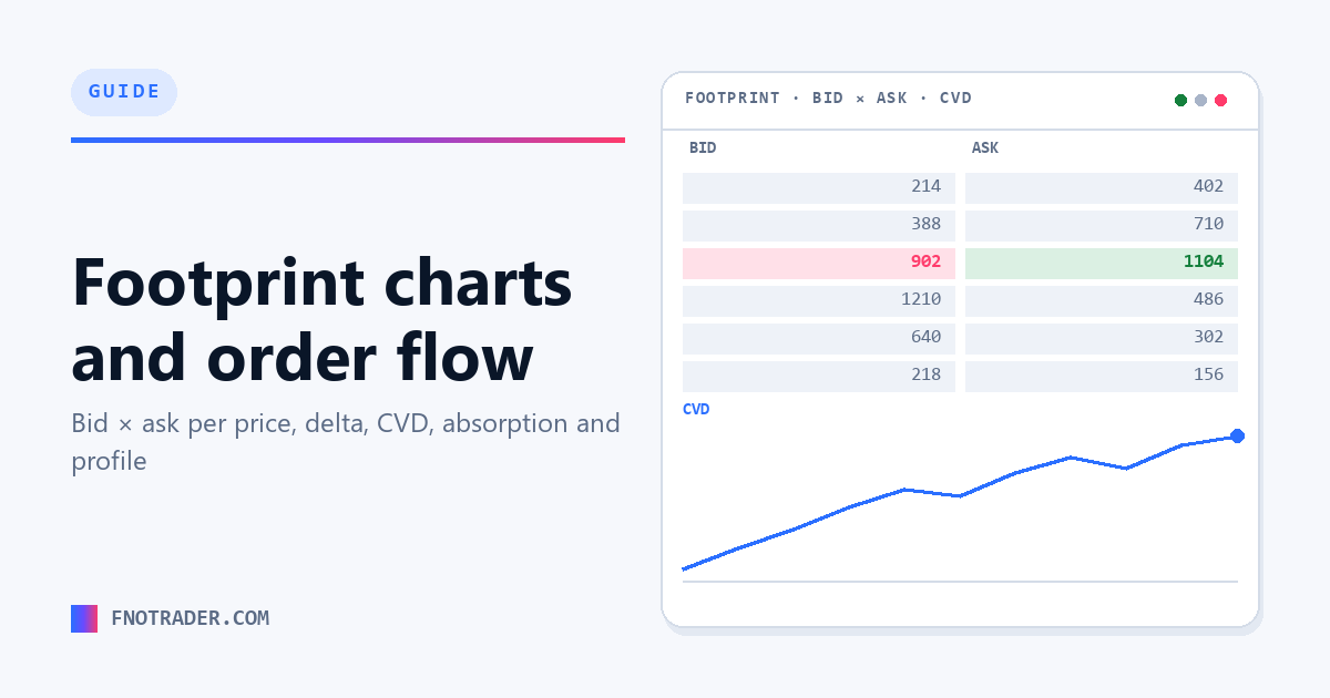
A footprint chart opens that candle up. Instead of four numbers per bar, every price traded inside it is listed, and the volume at each price is split in two: volume that hit the bid, and volume that lifted the ask.
That split is the whole point. Volume at the ask means a buyer crossed the spread to get filled — they paid up. Volume at the bid means a seller did. A green candle built on volume that mostly hit the bid is a very different event from one built on volume that lifted the offer, and on a normal chart the two are indistinguishable.
The reason this is possible at all is that Indian exchanges publish tick data with enough detail to classify each trade against the prevailing quote. Footprint is a rendering of that classification, not a derived indicator.
Reading a single cell
Each row inside the bar is one price, showing two numbers — conventionally bid volume on the left and ask volume on the right. Reading a bar means scanning down the ladder and asking three things:
- Where did the volume concentrate? The heaviest rows are where business was actually done, as opposed to prices that were merely passed through.
- Which side was aggressive at those rows? Lopsided rows show one side crossing the spread repeatedly.
- What happened at the extremes? Heavy volume at the high of a bar that then closes lower is a different story from thin volume there.
Most of the value is in the last question. Bars that fail at their extreme after heavy trade are the ones that carry information.
Delta and cumulative volume delta
Delta is ask volume minus bid volume within a bar. Positive delta means aggressive buyers dominated. Note that this has nothing to do with option delta, which measures price sensitivity — the same word is used for two unrelated things, and context is the only guide.
Cumulative volume delta (CVD) is the running total across the session, plotted as a line. It answers who has been in control since the open rather than in the last bar. For CVD to mean anything it has to be anchored to the session open — a line that carries over from previous days drifts and stops being interpretable.
The standard read is divergence. Price making a new high while CVD makes a lower high means each successive push is being achieved with less aggressive buying. That is not a signal to act on by itself, but it is a real observation about the composition of the move, which a price chart cannot provide.
The trap: a genuine trend has volume and one-sided delta on every leg. Price drifting upward on thin volume with balanced delta is not a trend, it is an absence of sellers — and it reverses the moment one arrives.
Imbalance, absorption and exhaustion
Imbalance is a price level where buy and sell volume are lopsided beyond a chosen ratio, measured diagonally across the ladder because that is how the bid and ask at adjacent prices actually pair up. Several stacked imbalances mark a level that was taken decisively rather than drifted through.
Absorption is the opposite situation and the more useful one: heavy volume trading at a price with price refusing to move away from it. Someone is filling against all that aggression with resting orders. Absorption at a level that has already been tested is the classic order-flow read.
Exhaustion is a volume surge at an extreme that fails to extend and turns over shortly after — the last willing participants having already acted.
All three are descriptions, not signals. What makes them worth watching is that they describe the mechanism of a move, so when a level holds you have some idea why.
Market profile and volume profile
Where footprint examines individual bars, profiles describe a whole session's distribution.
Market profile builds that distribution from time: each price is marked once for every time bracket in which it traded, producing a shape showing where the market spent its time. Volume profile builds it from traded volume instead. The two frequently disagree, and the disagreement is informative — a price with a lot of time and little volume was visited but not transacted at.
| Term | What it is |
|---|---|
| Point of control | The price with the most volume or time in the period — the level treated as fairest. |
| Value area | The band holding roughly 70% of volume or time, bounded by value area high and low. |
| Single print | A price that traded in only one time bracket, marking a fast move with no acceptance. |
| Initial balance | The range established in the session's first hour, used as a reference for the rest of the day. |
The framework underneath is auction market theory: markets move to advertise price, look for acceptance, and move on when a level is rejected. Value area and point of control are ways of measuring where acceptance actually occurred.
What this needs on Indian markets
Footprint analysis is only as good as the tick data behind it, which imposes some real constraints:
- Liquid instruments. Index futures and options on NIFTY, BANKNIFTY and SENSEX, and liquid stock futures, have enough trade density for the bid-ask split to mean something. A thin contract produces a footprint that is mostly noise.
- Session-anchored CVD. Cumulative delta has to reset at the session open — 09:15 IST for equity and F&O, 09:00 for MCX — or the line stops being readable.
- Correct contract. On futures, a chart pinned to an expired contract shows no live data at all, which is a surprisingly common cause of an apparently dead chart.
- MCX hours. Commodities run 09:00 to 23:30 IST, a much longer session than equities, so profile shapes are not comparable between the two without accounting for it.
Seeing inside the bar, in Footprint Charts
Order flow is only useful if it's in front of you at the moment you're deciding — not reconstructed afterwards, when you already know how the bar closed.
Footprint Charts renders bid×ask volume at every price, session-anchored cumulative delta, imbalance detection, and both TPO and volume profile, live, for NIFTY, BANKNIFTY, SENSEX and F&O futures plus MCX commodities. The CVD line resets at the IST open, so it answers who has been in control today rather than drifting across sessions.
That's the difference between buying a green candle and knowing whether the buyers inside it were starting or finishing.
Public documentation, no login: footprint guide, market profile guide, and an order-flow FAQ answering 89 questions.
Start a 7-day free trial No card needed. Every app, one login.
Common questions
What is a footprint chart?
A footprint chart is a candlestick in which every price traded inside the bar is shown, with the volume at each price split between volume that transacted at the bid and volume that transacted at the ask. It reveals whether buyers or sellers were crossing the spread, which an ordinary candle cannot show.
What is the difference between delta and cumulative volume delta?
Delta is ask volume minus bid volume within a single bar. Cumulative volume delta is the running total of that across the session, so it shows which side has been aggressive since the open rather than in the most recent bar.
What does CVD divergence mean?
CVD divergence is price making a new high while cumulative volume delta makes a lower high, or price making a new low while CVD makes a higher low. It indicates each successive push is being driven by less aggressive participation. It describes the composition of a move rather than predicting a reversal.
What is absorption in order flow?
Absorption is heavy volume trading at a price without price moving away from it, implying a participant is filling against the aggression with resting orders rather than stepping aside. It is the opposite of a breakout on volume.
What is the difference between market profile and volume profile?
Market profile builds the distribution from time, marking each price once per time bracket it traded in. Volume profile builds it from traded volume. They often disagree, and a price with much time but little volume was visited without much business being done there.
Are footprint charts available for Indian markets?
Yes. Indian exchanges publish tick data detailed enough to classify trades against the prevailing quote, so footprint charts work on NSE and BSE index and stock futures and options and on MCX commodities. Liquidity matters — thin contracts produce a footprint that is mostly noise.
Which instruments work best for order flow analysis in India?
Liquid ones: NIFTY, BANKNIFTY and SENSEX index futures and options, liquid stock futures, and actively traded MCX commodities. The bid-ask split needs sufficient trade density to be meaningful.
Related
App: Footprint Charts · Strategies: Options School (free, no login) · Definitions: trading glossary · Free tools: position sizing & risk calculators · More: all articles